
PUMA RED
membership program
BRAND IDENTITY
DISCIPLINES
Graphic Design
Creative Direction
Animation
Artworking
Guidelines Development
THE BRIEF
With no brand prescence associated with their membership program in the marketplace, PUMA approached us to develop an identity for their brand-new global membership approach, starting with an initial V1 online rollout across social and CRM.
THE RESPONSE
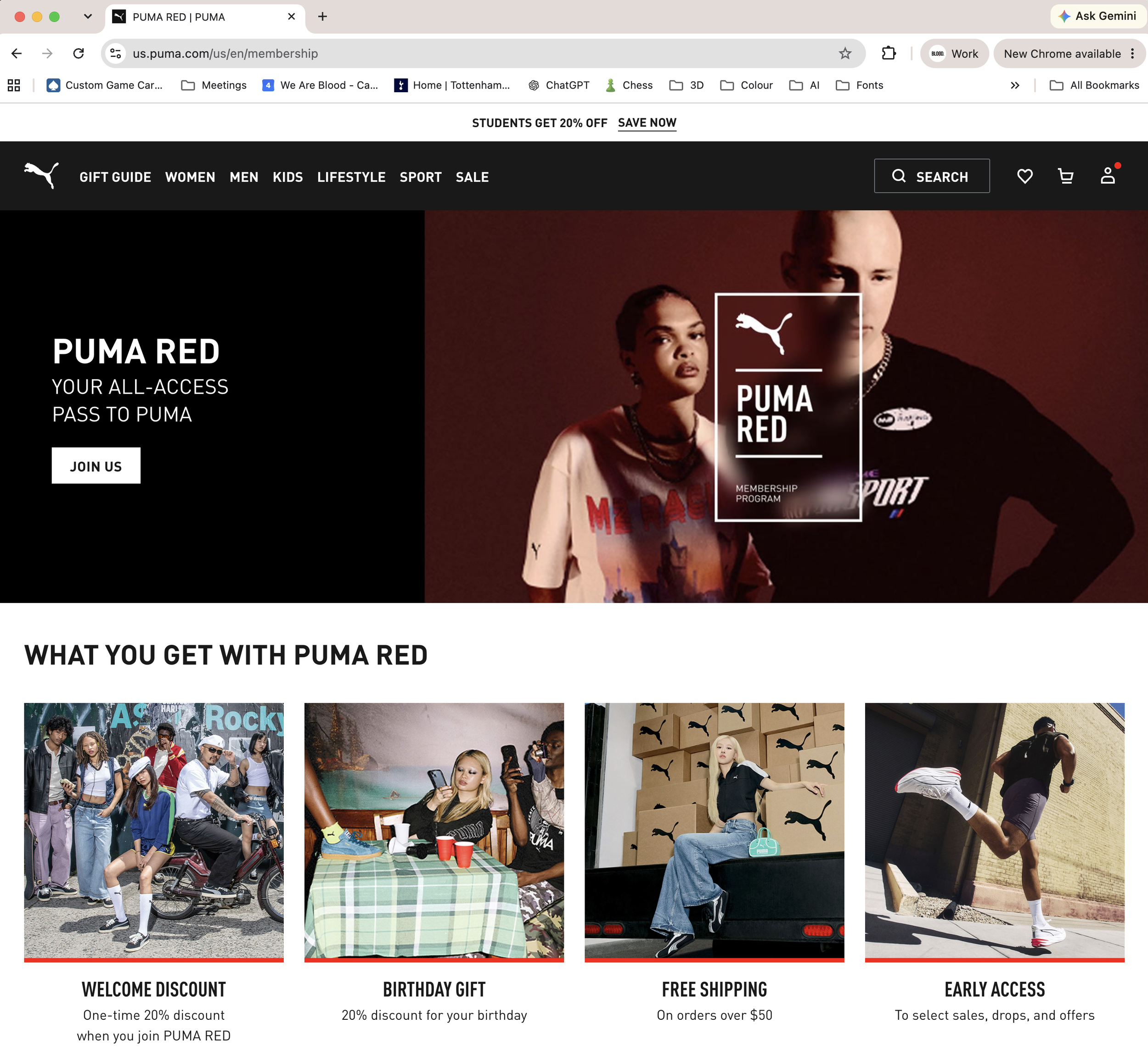
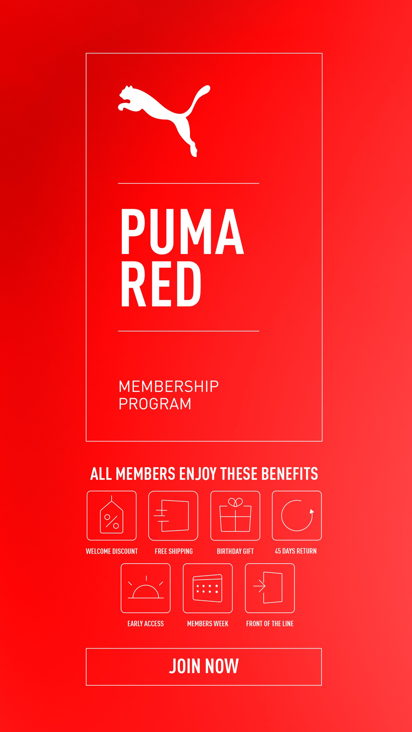
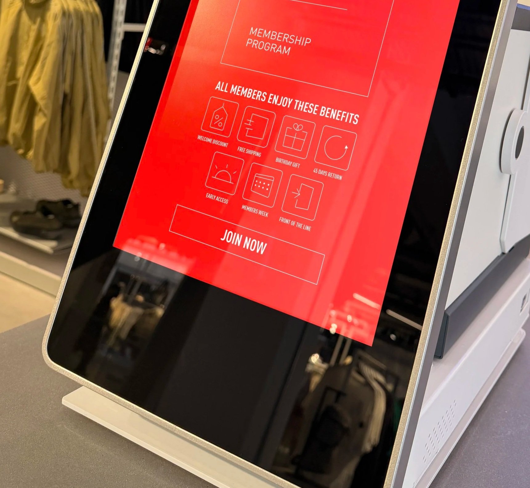
The development of a simplistic yet functional container-based logo structure and design system that was implemented across the brand as a whole. Working as a secondary piece of branding to support the master PUMA brand, whilst making it clear and ownable to use across assets, imagery and social media.
THE RESULT
A super clean, simplistic yet elegant brand logo that is functional first, UX/UI capable, and sympathetic to the master PUMA brand without clashing.
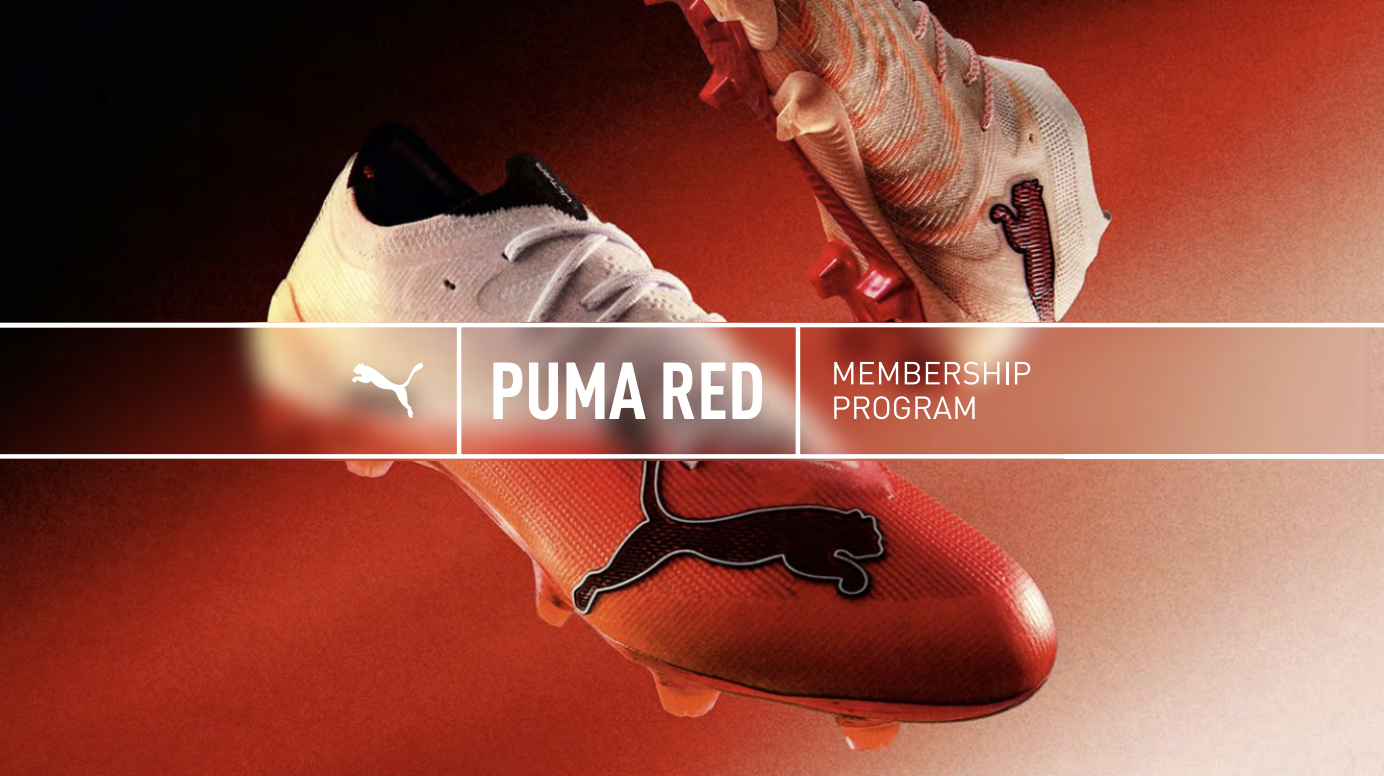
SIMPLICITY
The key to designing this brand was ensuring it worked across a wide range of sizes and formats, from expansive landscape layouts to compact portrait applications and the smallest digital touchpoints. It also needed to sit comfortably alongside the wider PUMA master brand without competing with it. This called for a clear, considered and adaptable design approach.
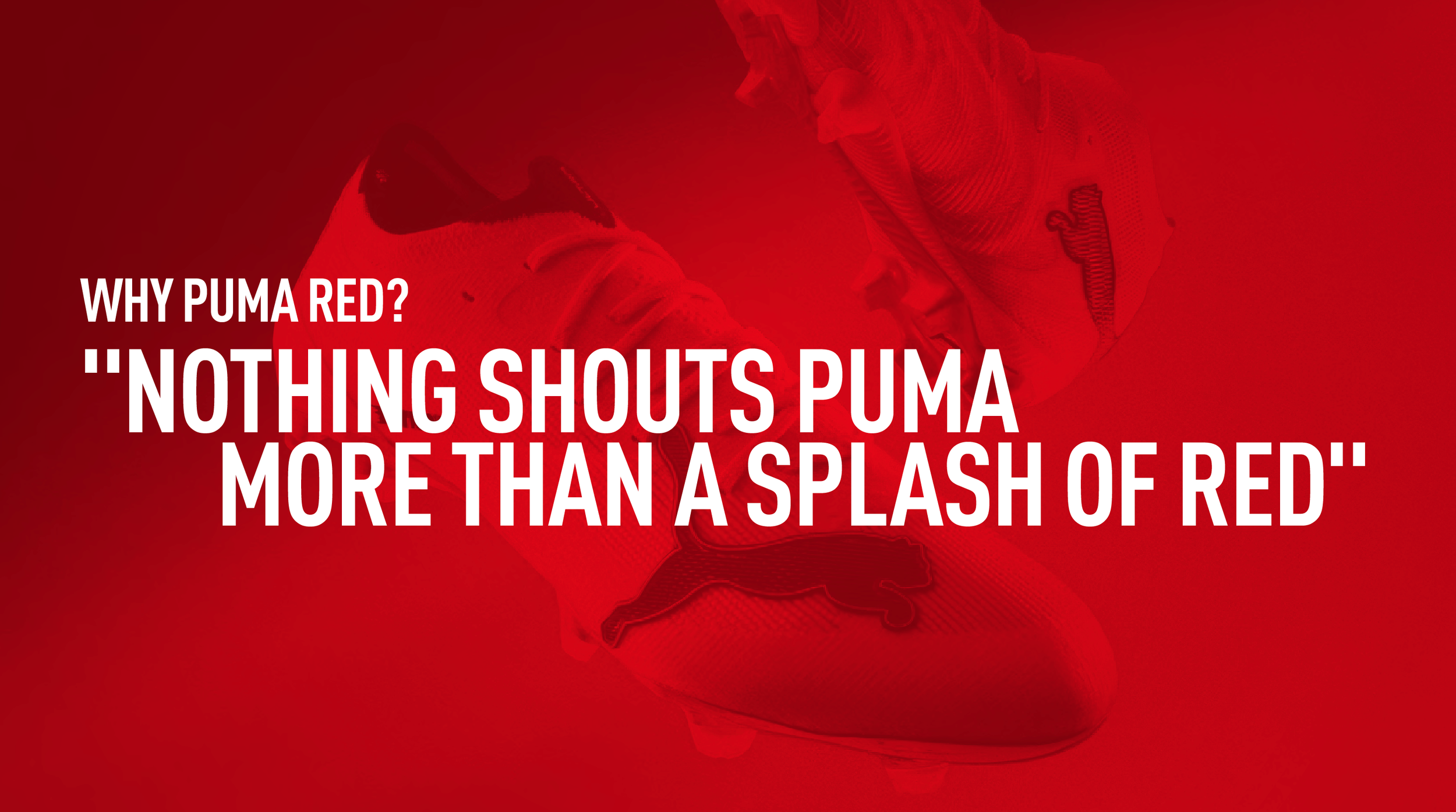
BLURRED LINES
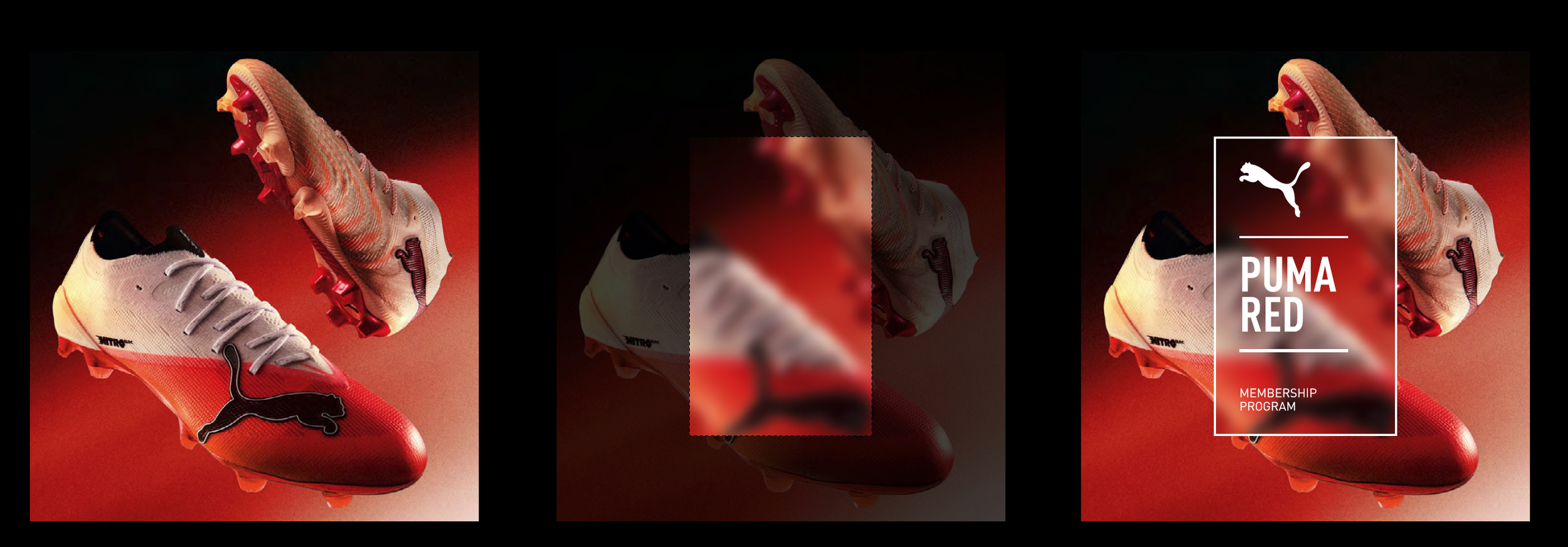
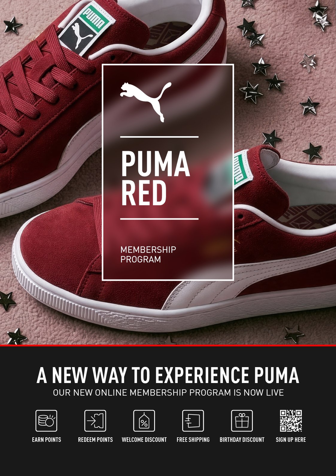
One piece of language that you will see throughout this brand is the blur. This was a play on one constant throughout the entire PUMA ecosystem that could be related back to, which was movement.
Therefore, motion blur sits underneath our logos and blurs out anything that sits underneath. This gives solid design rationale to be able to reveal and hide in design, visible & invisible.
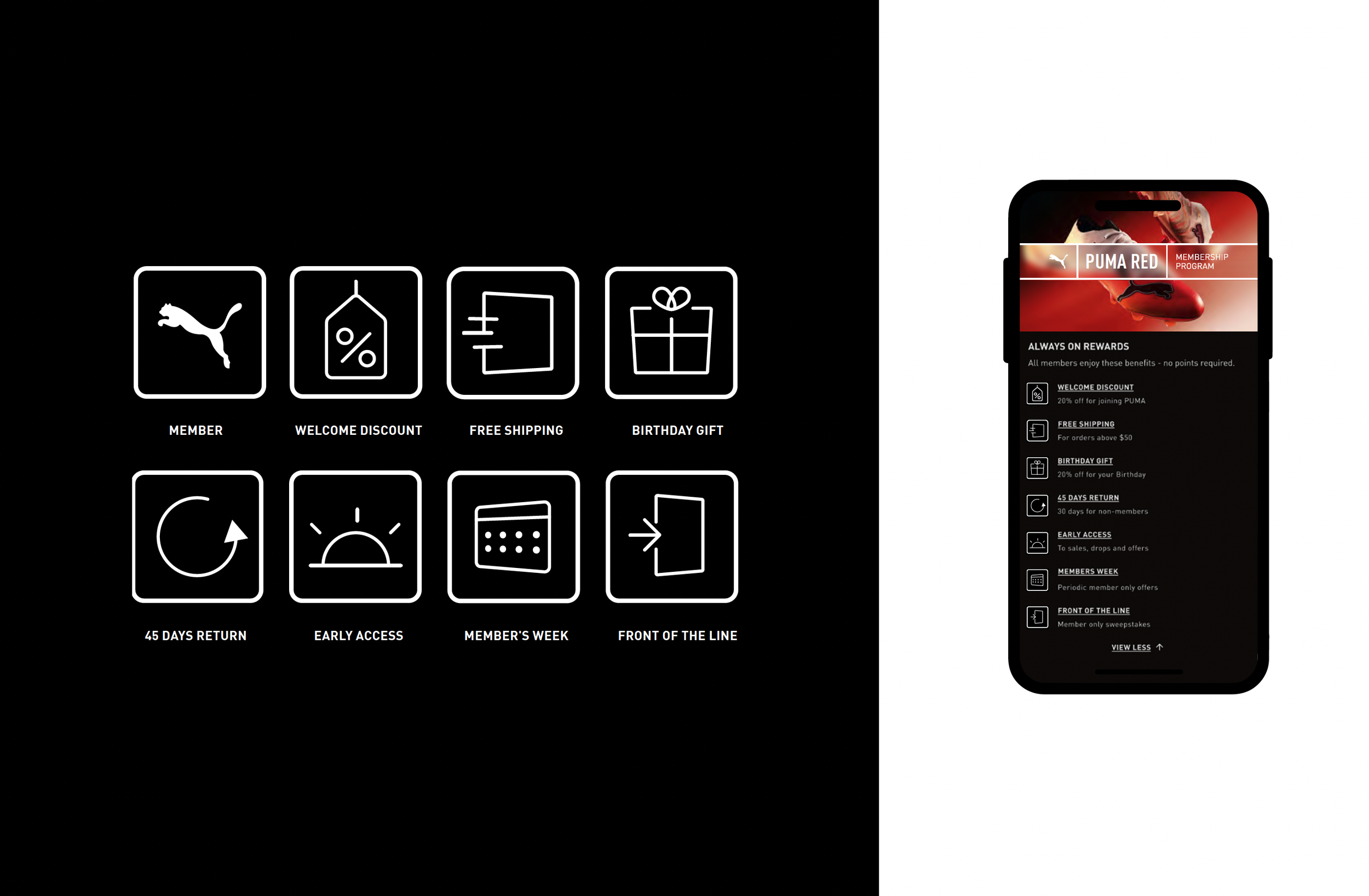
ICONOGRAPHY
Clean, understated icons support our brand through subtle, dynamic graphics, combining simplicity with traditional keyline design.
LIKE WHAT YOU SEE?
We would love to take you through more of our work and share our capabilities in person or via video. To understand how we can help you develop beautiful creative or build bespoke activations; Request our creds over there >>>>>>>>>>>>
