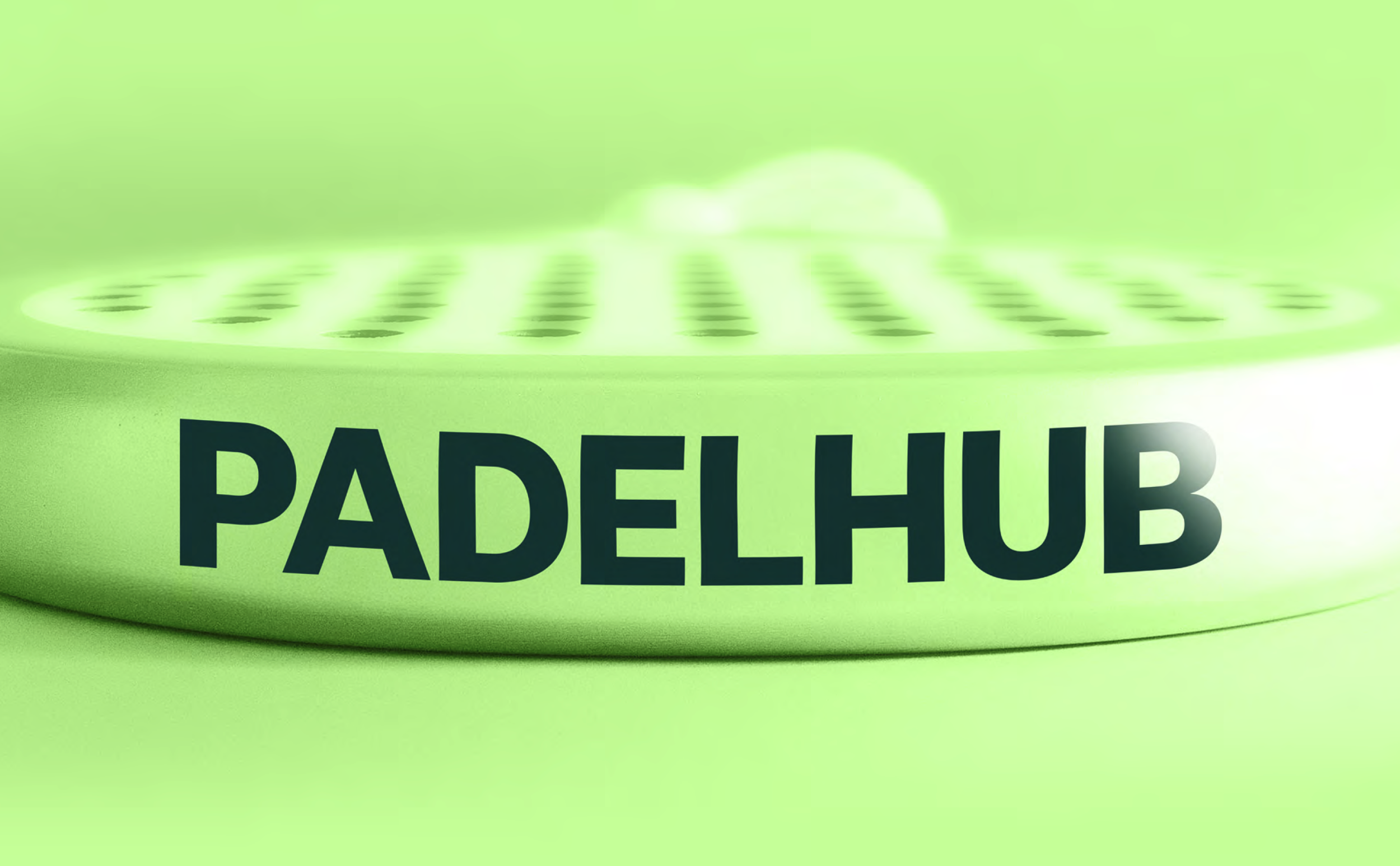
PADELHUB IDENTITY
REBRAND_2025
DISCIPLINES
Brand Strategy
Creative Direction
Graphic Design
Brand Direction
Copy & Tone Exploration
THE_BRIEF
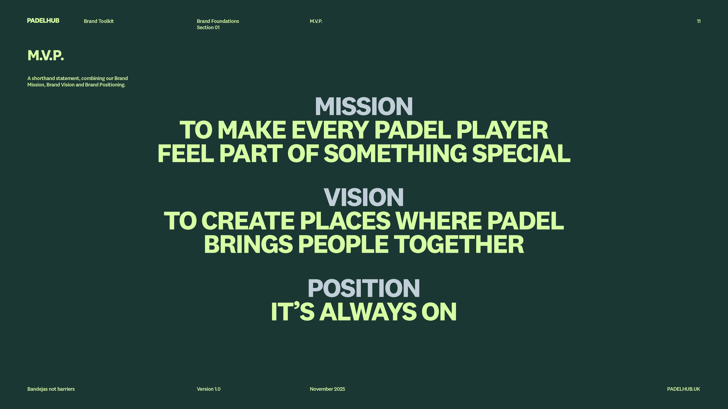
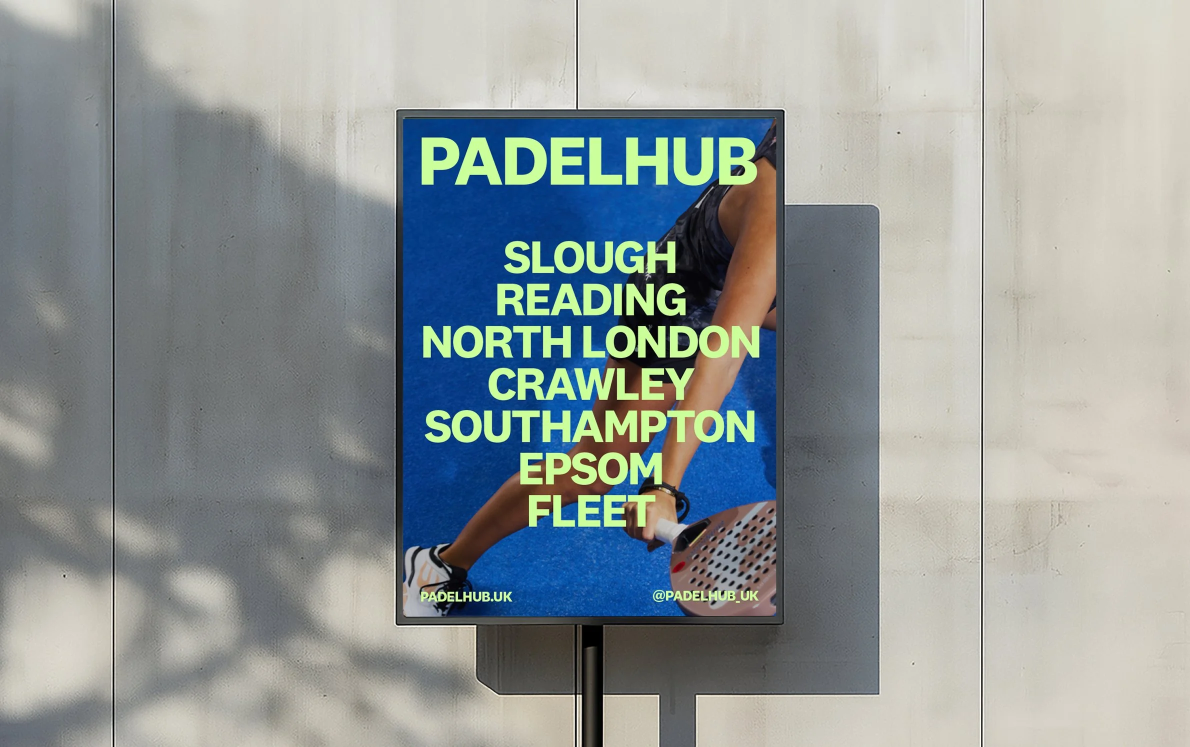
The brief was to rebrand PADELHUB, creating a future-facing identity that will carry the brand forward over the next decade as it grows to become the UK’s leading indoor padel business. The rebrand needed to reflect ambition, inclusivity, and progression positioning PADELHUB not just as a place to play, but as a national destination for the sport as it continues to grow across the UK.
THE_RESPONSE
We spent the time building three creative routes that delivered three states of rebrand. 1.Evolution: A new version of old creative. A touched up and tweaked version of old. 2.Elevation: An elevated brand. Sportstyle modern. Ownable colours, A brand for the future of the business. And, finally… 3.Revolution: Pushing the boundaries of what could be.
THE_RESULT
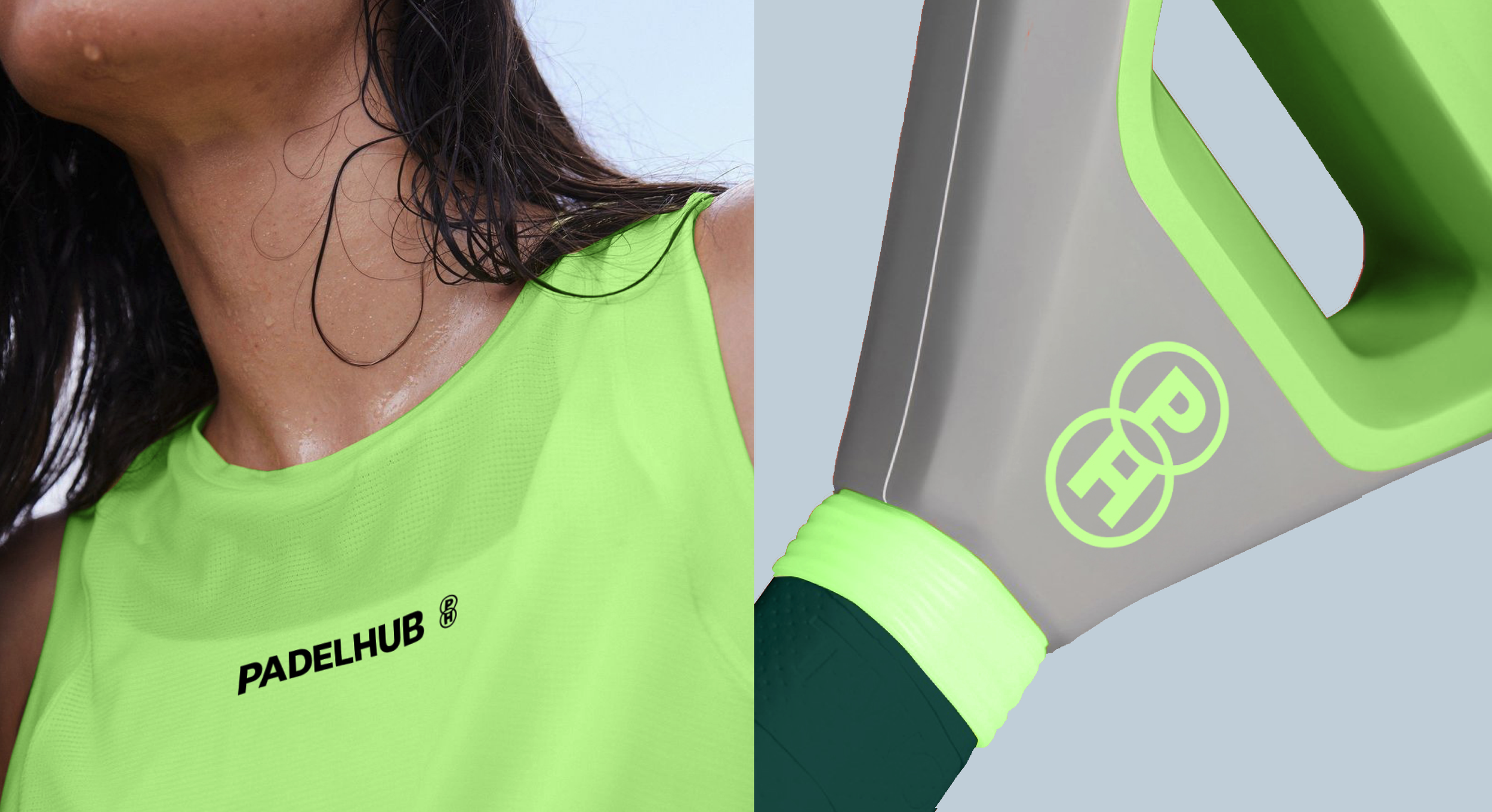
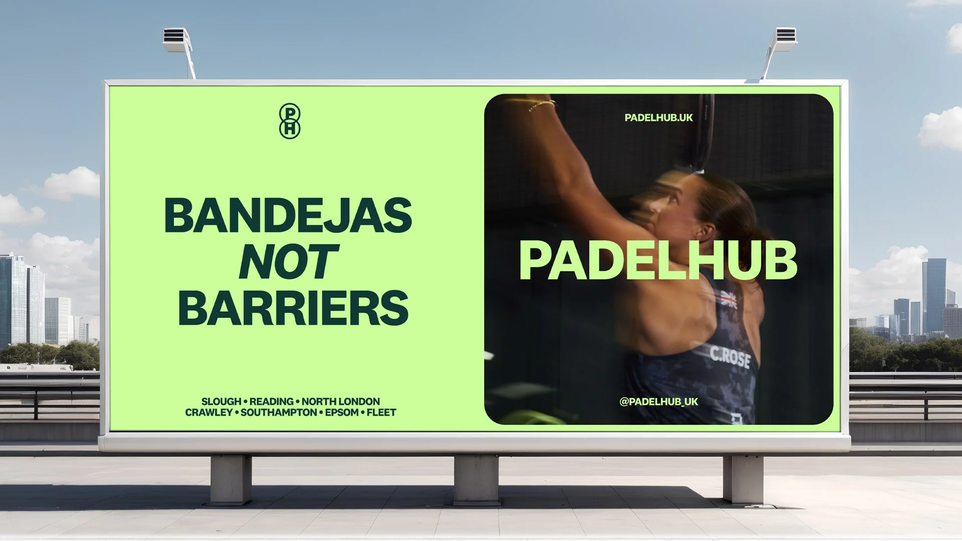
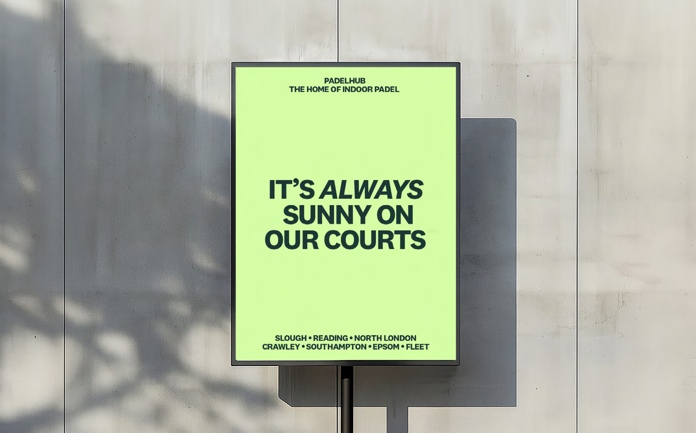
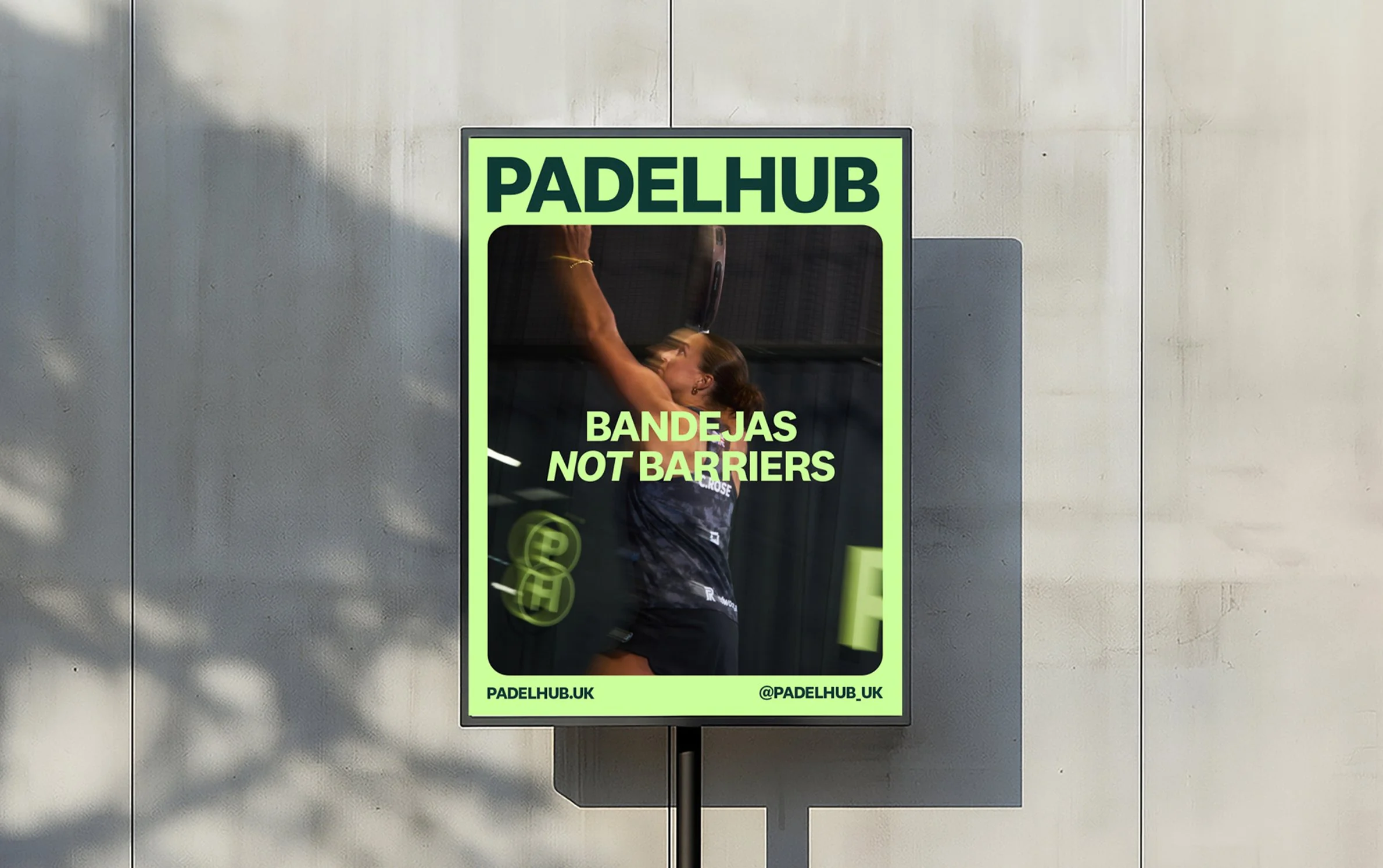
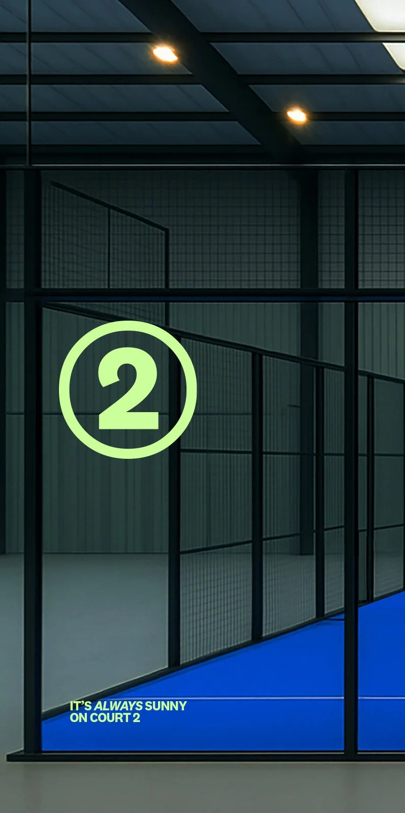
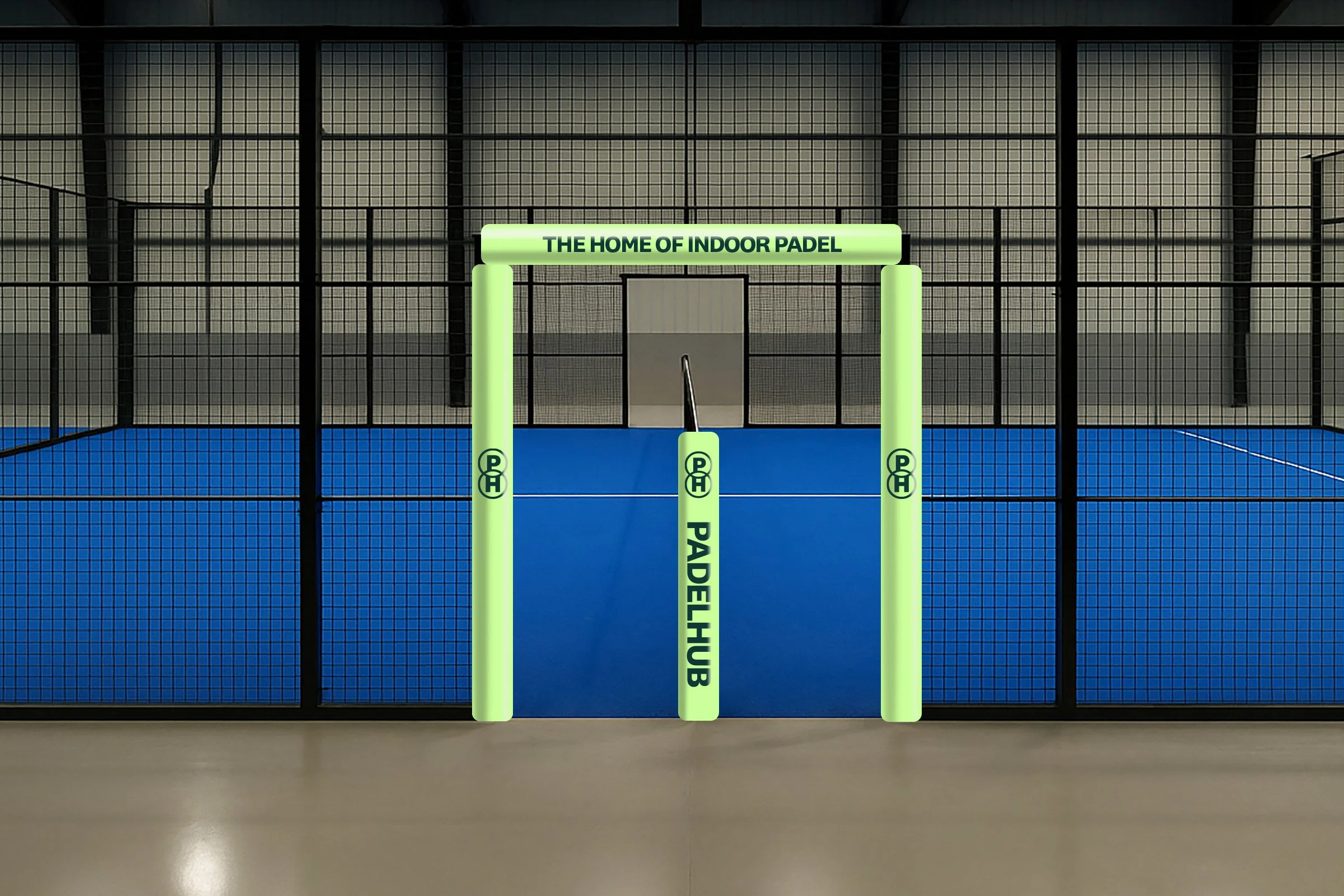
To reflect PADELHUB’s premium offering; from world-class courts to elite coaching, we elevated the brand into a more aspirational and desirable space whilst retaining an inclusive feel. This identity reinforces the value of the experience. Timeless typography, contemporary colour palette and a bold graphic language positions PADELHUB as the go-to destination for padel, for everyone.
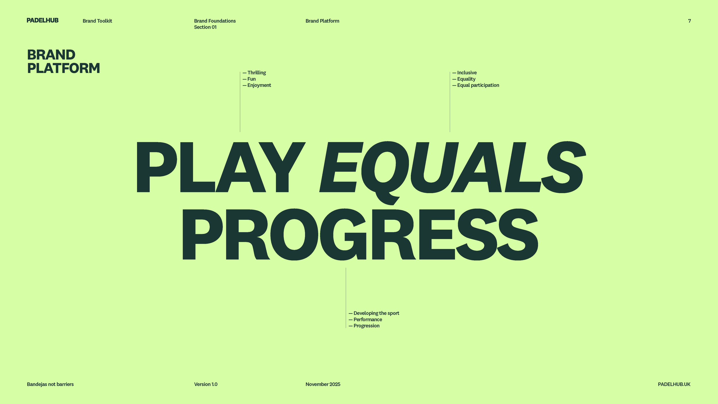
We created this proposition to clearly define and communicate the value of what we offer as PadelHub. It what we offer and why it matters.
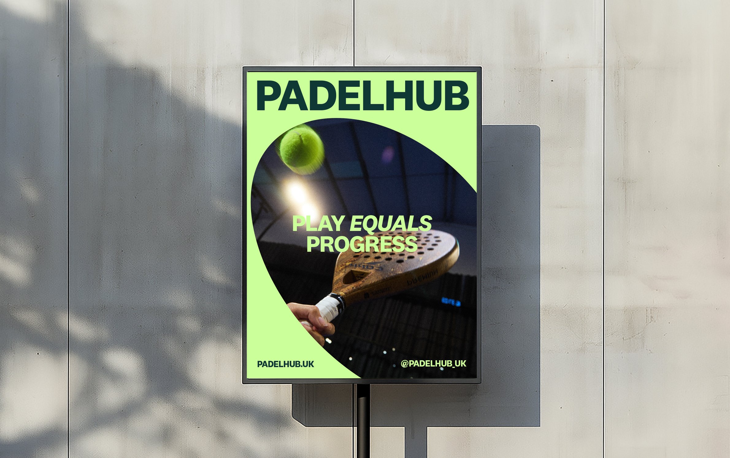
PLAY. EQUALS. PROGRESS.
This proposition captures the heart of Padelhub. We offer a social space where people can play, have fun, and feel equal—part of an inclusive community—while still having the opportunity to develop their style and progress their ability at their own pace.
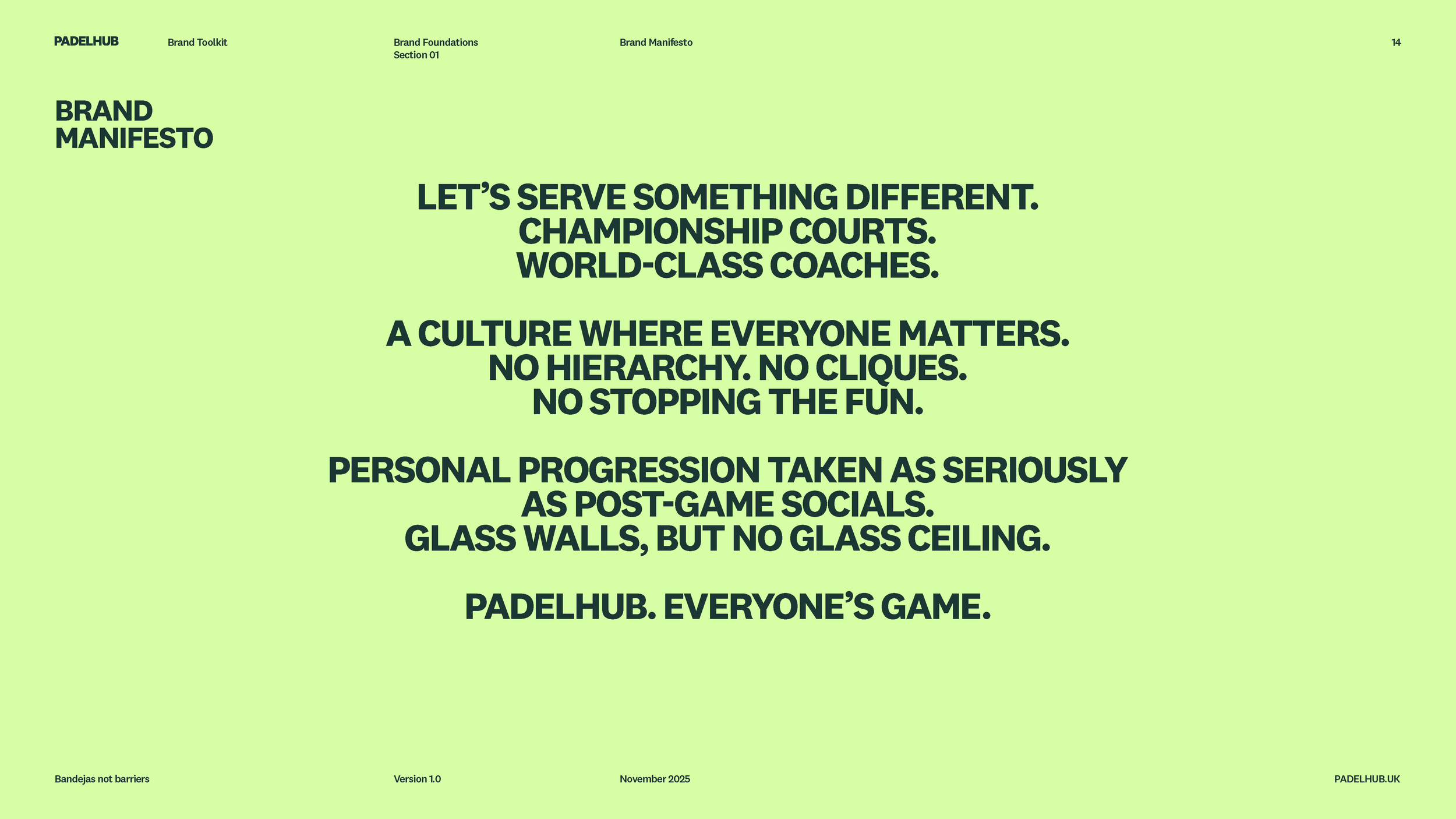
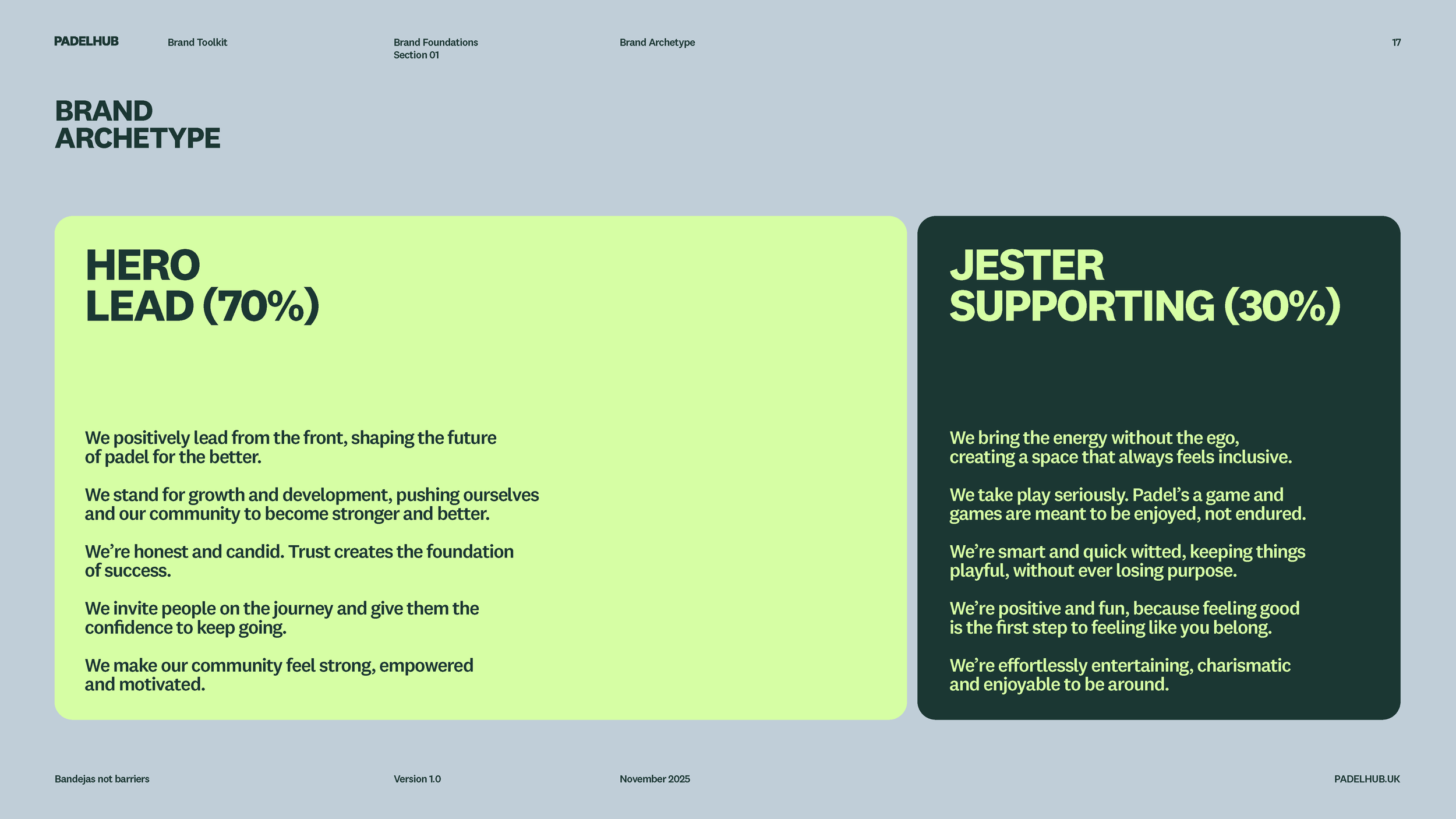
Then we worked to create a manifesto and a tone of voice that allows us to comminucate and speak with purpose and style. Building a split archetype meant that we could lead with a strong hero language but inject humour into our message with a jester element.
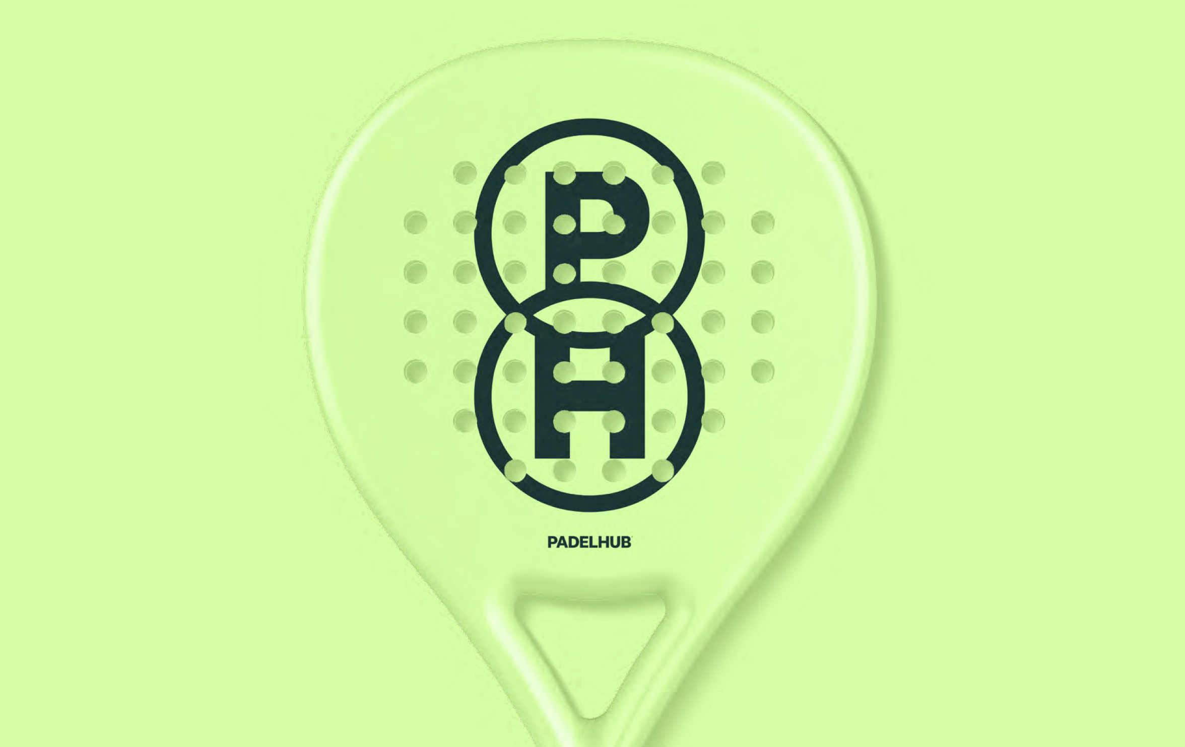
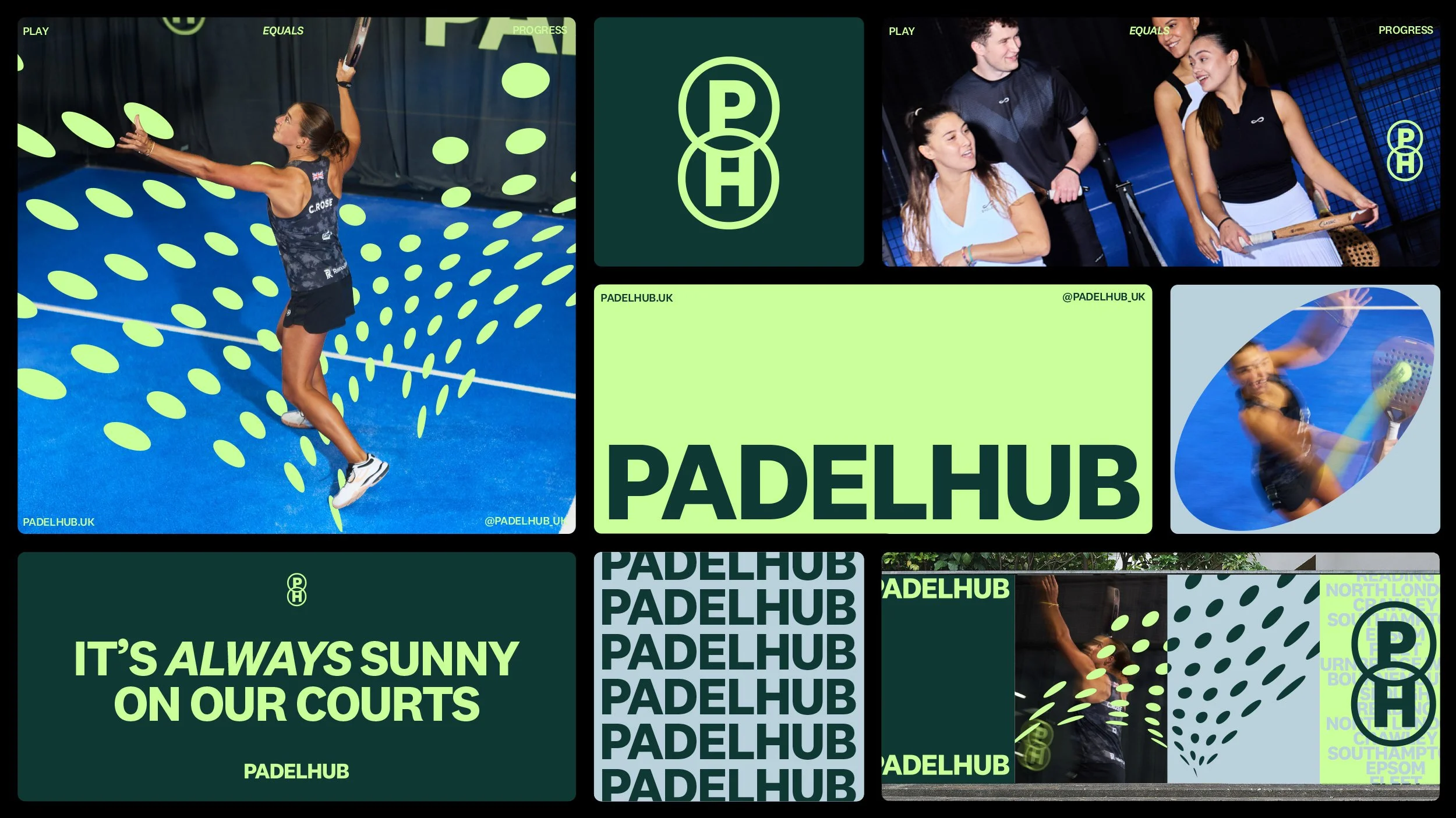
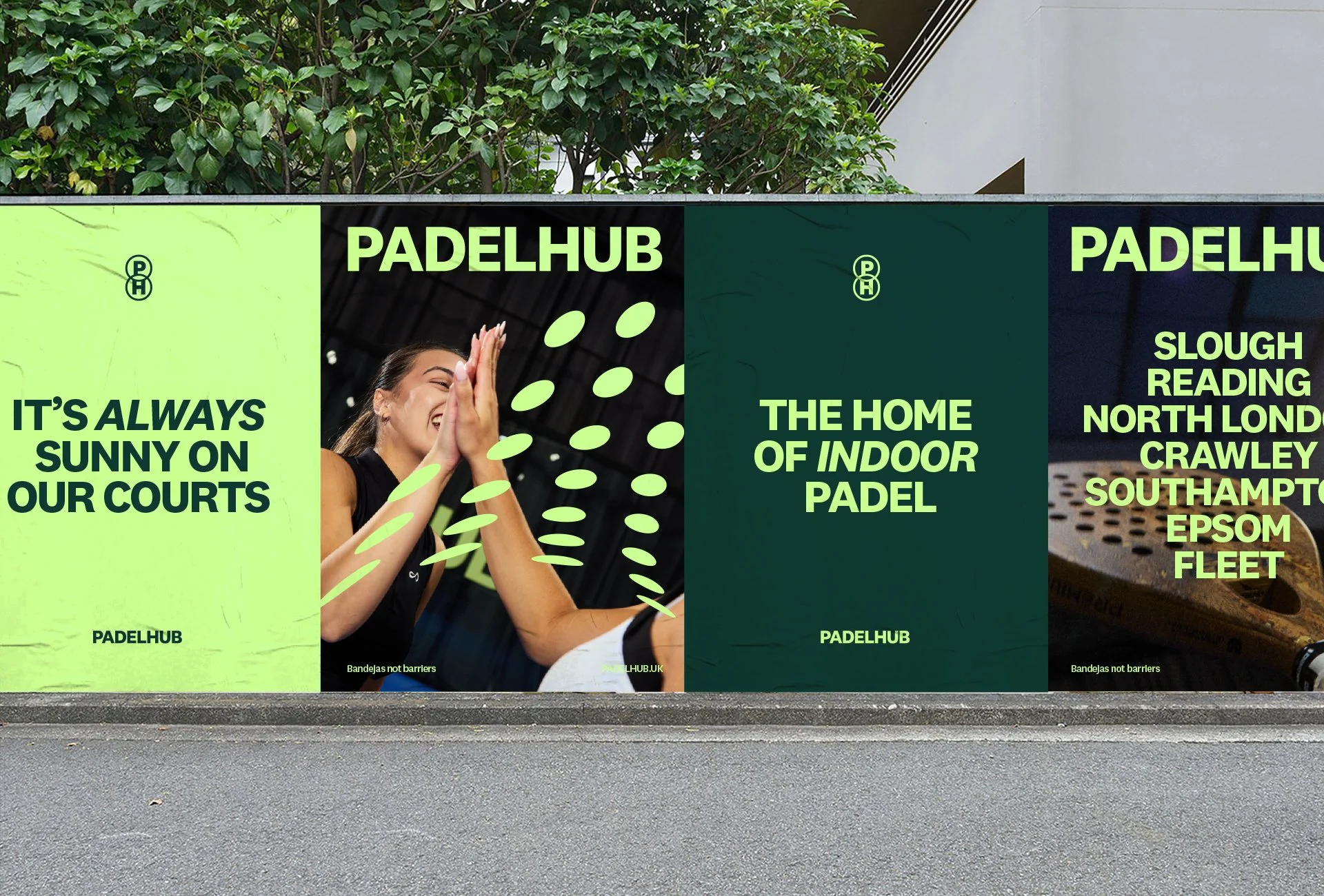
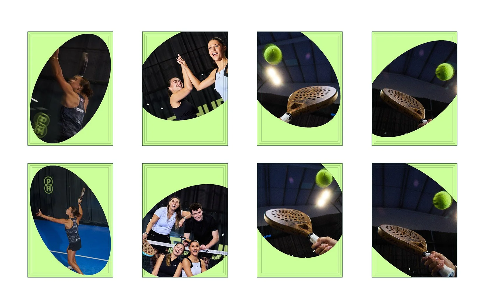
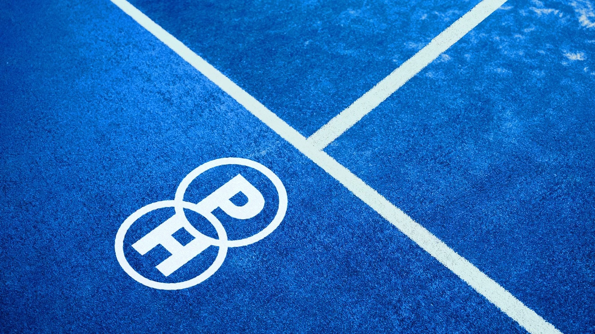
Our dot pattern is more than a graphic. It’s a visual nod to the game of Padel and the energy behind it.
This is the foundation of our shape language, used to build rhythm, movement and identity across applications.

DISCLAIMER: Some images shown in this case study are used for mock-up purposes only and are not owned by PadelHub or Blood. No usage rights are claimed. Images will be removed upon request.
LIKE WHAT YOU SEE?
We would love to take you through more of our work and share our capabilities in person or via video. To understand how we can help you develop beautiful creative or build bespoke activations; Request our creds over there >>>>>>>>>>>>