International
Olympic_committee
Olympic_Qualifier_Series
BREAK. CLIMB. SKATE. RIDE
The Olympic Qualifier Series was the ultimate stage for Paris 2024. The two-part festival-style series debuted in Shanghai and Budapest to determine which athletes would qualify for Paris 2024 in breaking, sport climbing, skateboarding and BMX freestyle — 4 new sports making their Olympics debut.
Working with partner agency This Place, we were tasked with creating a full brand identity, 360 toolkit and promotional video for this all-new Olympic event.
DISCIPLINES
Creative Direction
Motion & Video
Graphic Design
Print Layout
Everyone loves a sticker
To cater for the variety of uses needed across the series, we created the Olympic Qualifier Series logo system; A system of parts, variants, styles, and formats that can be used in combination to provide a flexible, adaptable, and consistent representation of the brand in a variety of contexts and situations. The main form this took was the Primary sticker iteration, designed to look like a hurriedly applied die-cut decal.
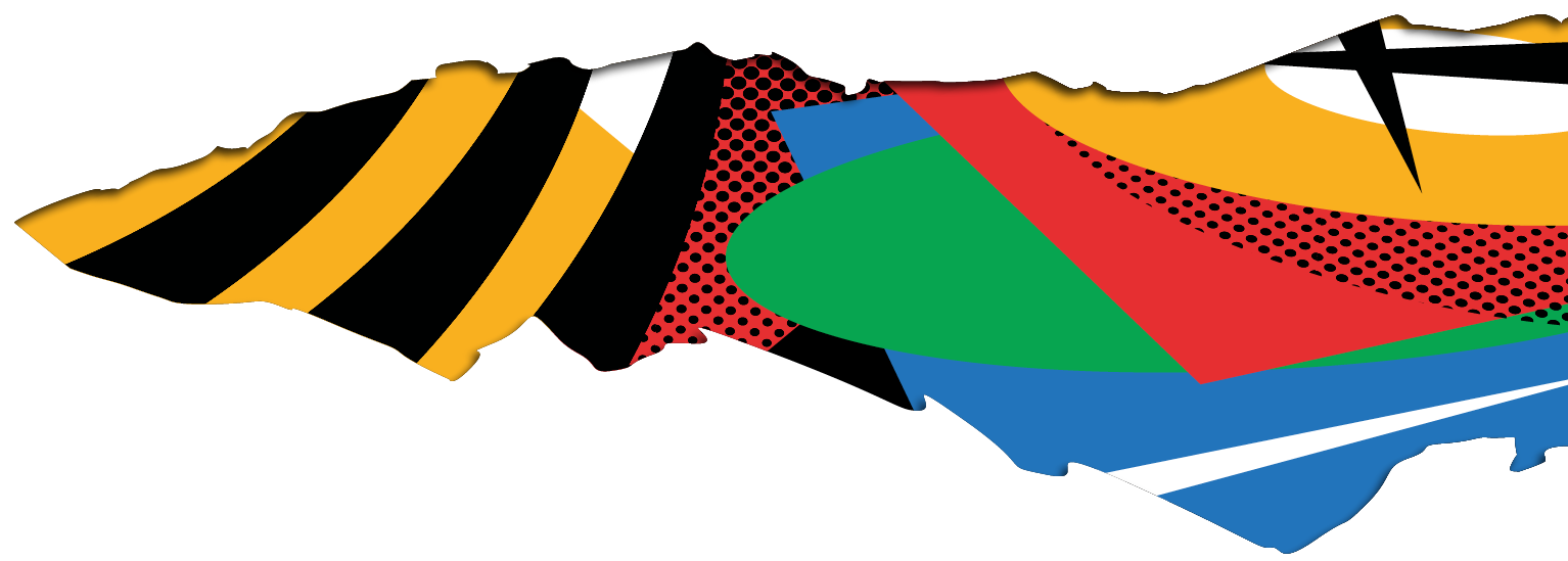
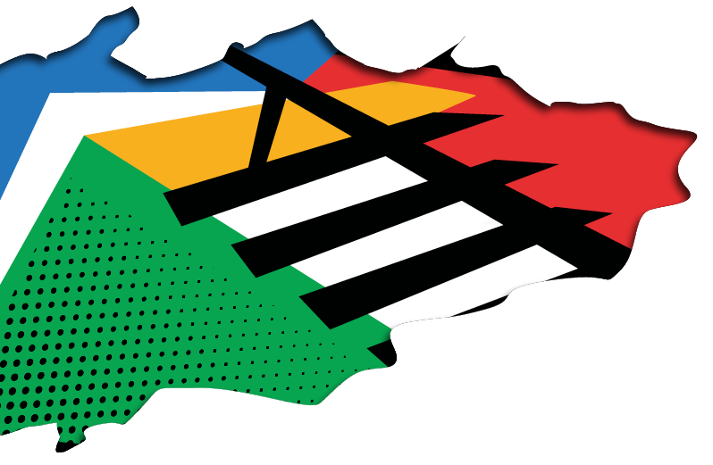
The Field of play
The Olympic Qualifier Series 'Field of Play' is a new abstract depiction of the well loved Olympic Field of Play found in the master Olympic Brand Guidelines. It lives to champion the four sports that make up the Olympic Qualifier Series.
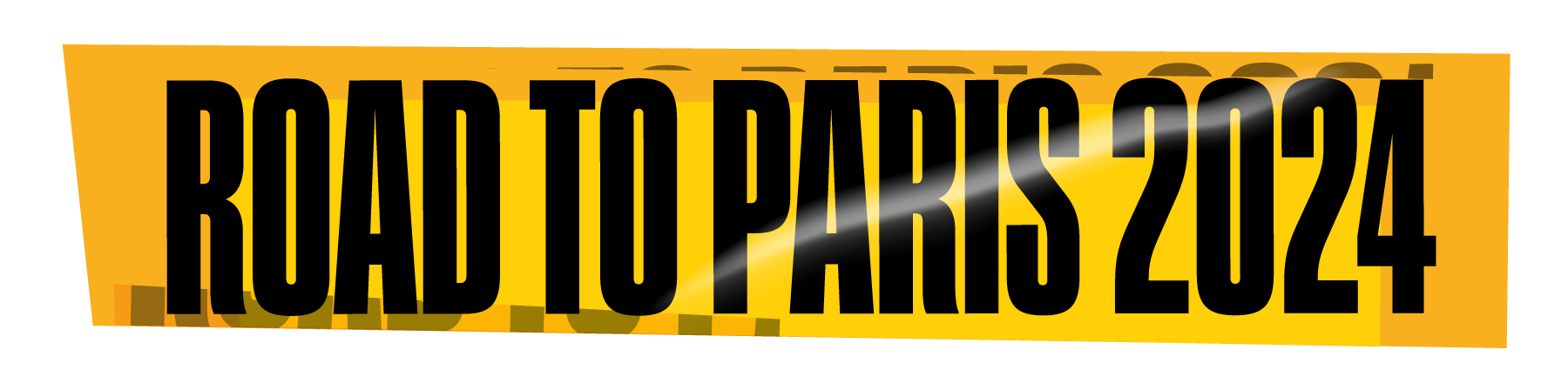
taping
We introduced taping as a messaging or CTA device. Echoing classic hazard tape and following the same sticker aesthetic we introduced in the OQS logo.
Rips & Tears
Used to create space for content, whether text, messaging or partner logos, or as a technique for the application of our Field of Play as an abstract pattern.
SHANGHAI
First stop of the series was Shanghai where our brand identity and aesthetic was rolled out across a massive footprint, predominantly using white as the base colour.
BUDAPEST
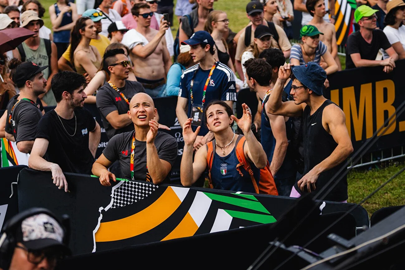
Stop #2 saw us touch down in Budapest at the Ludovika Campus of the National University of Public Service, where this time the focus was primarily on the black base from our creative.
Sometimes, you just need a moment to chill! The Athlete’s Club was a space where competitors could relax, meet people from different nationalities, and have fun. We were tasked with creating a logo for the club that lived within the overall OQS aesthetic whilst forming it’s own identity.